A Raffles Boston Condo Trades Neutrals for Jewel Tones
Color, texture, and playful sophistication define a California couple’s New England pied-à-terre.
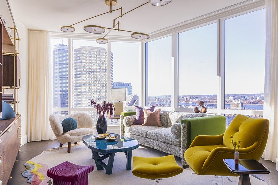
Photo by Somerby Jones
This article is from the spring 2026 issue of Boston Home. Sign up here to receive a subscription.
With one branch of their business in Boston, a California-based couple found themselves traveling frequently to the city. Growing tired of staying in hotels and wanting a more personal experience, they decided to purchase a condo at Raffles Boston. “Because they were coming here so often, they wanted something that was their own—comfortable, but also playful in a sophisticated way,” says interior designer Stephanie King. With larger, more neutral residences on the West Coast, the clients were eager to explore a different expression for their new home away from home. “They thought, ‘It’s not huge, so let’s do something fun that shows another side of our style,’” King adds.
Working from that mindset, King and her clients leaned into the interplay of color, material, texture, and shape. The open floor plan and sweeping Back Bay views offered a clean slate. “They loved the idea of keeping the walls and architecture very light and bright, so you could look past the furniture and still see the cityscape,” King explains. “But they also wanted splashes of color in the furnishings, accessories, and art.” After reviewing a range of fabrics, paints, and wallcoverings, the team homed in on rich greens, turquoises, and jewel tones, bold yet balanced choices that kept comfort front and center.
In the living room, the design is grounded by a custom Atelier rug, while a mustard Vladimir Kagan chair, a bouclé sofa upholstered in a custom woven fabric from Chapas Textiles, a magenta stool, and a turquoise lacquered coffee table establish a dynamic setting. “Everything packs a bit of punch instead of being just little moments of color,” King says. Custom walnut built-ins by Amuneal, complete with an antique mirror, integrated bar, and concealed storage, add multi-use functionality. In the adjacent dining area, an art piece from one of the couple’s California homes proved a natural fit, inspiring a trio of velvet dining chairs in pink, purple, and coral that deliver refined whimsy. Overhead, sculptural lighting by Lindsey Adelman and a mobile-inspired fixture from Holly Hunt provide playful movement between the two spaces.
With a color palette that features dark maroons, deep purples, and graphite grasscloth wallpaper, the office/guest bedroom is a luxurious spot for both work and winding down. / Photo by Somerby Jones
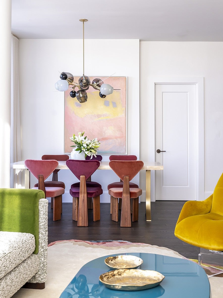
In the dining room, three chairs in different velvets— featuring tones of pink, purple, and coral—deliver a playful yet elegant look. / Photo by Somerby Jones
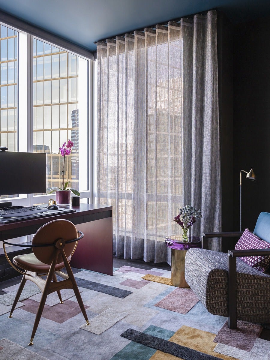
In the client’s office, which doubles as a guest room, King shifted the mood. “We designed a custom walnut-and-brass Murphy bed with storage on either side,” she notes. Charcoal grasscloth wraps the walls, continuing a color-blocking approach. “We stayed within a very specific palette of charcoal, turquoise, and burgundy-esque accents; you’ll see it in the rug, the purple side table, and the lacquered desk.” The primary bedroom offers a more serene expression of color while remaining connected to the rest of the residence. “They wanted it to feel soft and elegant,” King says. Because it’s a confined space, a custom bed designed by Masterpiece extends across the wall, incorporating brass nightstands. “We wanted everything to have a big presence.” Subtle injections of purple and pink also allowed the team to mix atypical combinations, while custom-blown pendants from Jeremy Maxwell Wintrebert add a warm glow.
Throughout the home, King’s approach creates distinct moods that feel cohesive rather than compartmentalized. “Every space gives a hint of what comes next,” she concludes. “Each room has its own energy, but they connect together as a whole.”
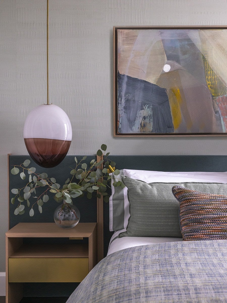
The serene and soft primary bedroom is ideal for relaxation and revitalization. Muted greens and rose, along with a warm touch of brass, serve as a tranquil space for the homeowners. / Photo by Somerby Jones
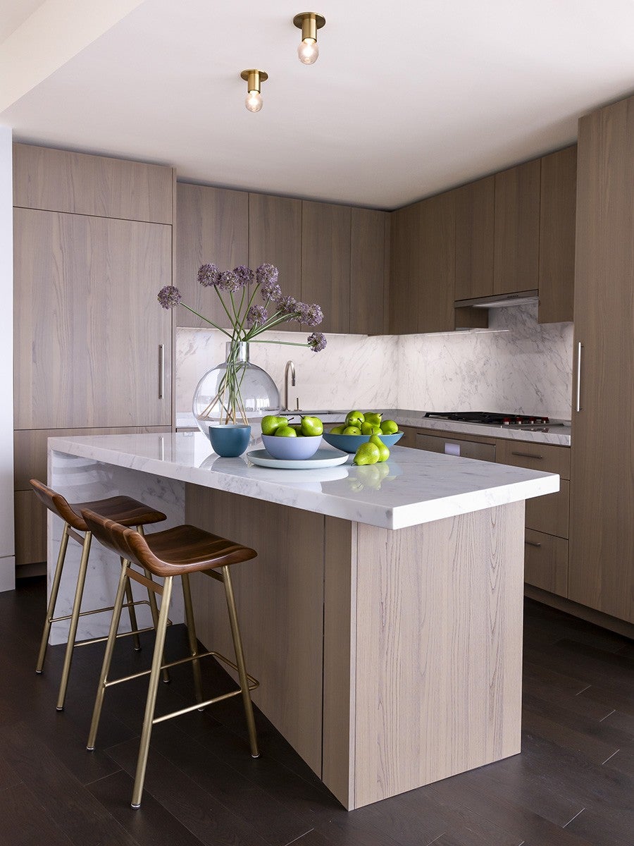
Clean lines, understated fixtures, and stylish stools give the kitchen an inviting aesthetic. / Photo by Somerby Jones
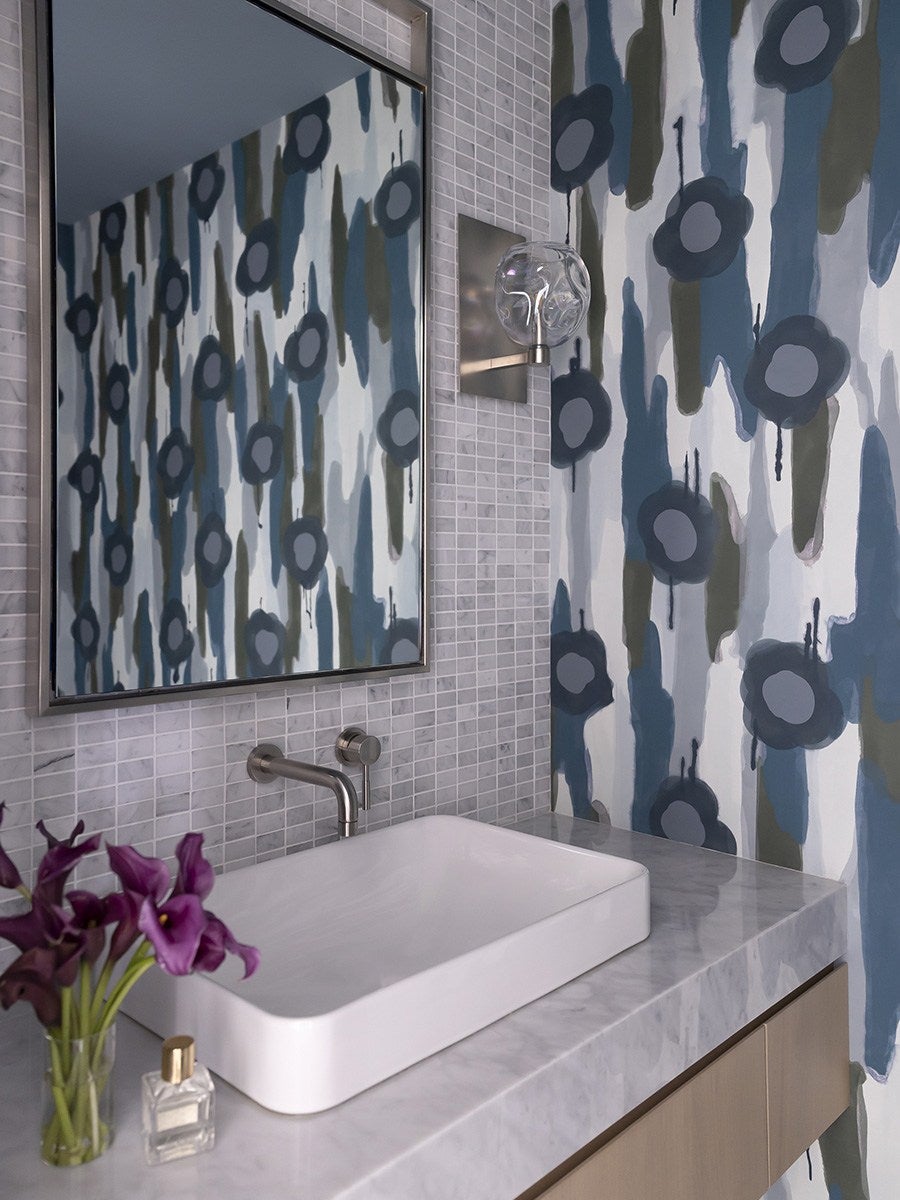
In the bathroom, pops of color are embraced, and their use balances the boldness, moodiness, and softness, which flow effortlessly from space to space throughout the home. / Photo by Somerby Jones
Builder The Lagasse Group
Interior Designer Stephanie King Design
First published in the print edition of Boston Home’s Spring 2026 issue, with the headline “East Coast Expression.”